
Loan Intake
Launched
Q1 to Q2 2024
My Role
Product Designer (fractional, sole)
Scope
Conversion · UX copy · Funnel design
Scale
Intake through contract signing

The Problem
The first touch was losing two in five visitors.

weekly submissions per first visit, at baseline
the business target
funnel surfaces redesigned
designer on the funnel
THE ENGAGEMENT
Brought in for support. Took the lead.
I joined as a fractional product designer, the only designer on the funnel, working with one product manager and handing finished designs to engineering for build. The original ask was design and copy support across the funnel. After reviewing early concepts I flagged the intake experience as the biggest gap and took the lead on redesigning it, then extended the work stage by stage down the funnel.
There was no existing UX framework to inherit. Every screen was effectively a first draft, and every piece of copy had to clear legal and compliance review before it shipped.
CONSTRAINTS & DECISIONS
The real work was deciding what to do inside the rules.
Compliance review on all copy
Some directions were flagged outright. Where copy could not change, placement could: the call and text consent disclosure had to stay on the page, so I moved it lower in the layout, out of the primary task path, and it cleared review. Persuasive intent survived; the disclosure stayed intact.
Regulated data collection
The funnel needed DOB and SSN, but not on the first touch. I moved both out of the opening steps into the second personal information page, and cut five low-value fields entirely: time at residence, education level, employment industry, housing status, and employment start date.
Mobile-primary audience
Every layout was designed mobile-first. Desktop existed but carried a small minority of traffic, so it adapted from the mobile design, not the other way around.
Weekly release cadence
Changes shipped sequentially and were read against weekly production submission rates. That means I report the measured trajectory, not clean per-change attribution, and I say so.
THE TESTING PROGRAM
Think, make, check, weekly.
We ran a Lean UX loop: propose, ship, read the weekly number, decide the next move. The metric never changed: intake submissions divided by first visits, weekly.

Feb. 7
4 fields
WEEKLY RATE: 64%

Feb. 15
Email only
My first structural proposal: ask for email only. No name, no phone. It took technical and security sign-off to get there. The form got simpler; the page around it was still heavy with explanation.
WEEKLY RATE: 65%

Feb. 21
Copy compression
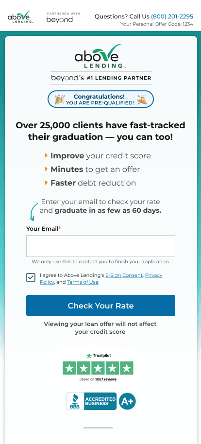
Cut the copy hard for scanning: three short benefit bullets, and the form pulled higher on the page. First reduce what you ask, then reduce what they read.
WEEKLY RATE: 69%

Feb. 29
Full rewrite
Full copy rewrite: shorter still, benefit-first, a clearer CTA. The largest single-week jump of the engagement, 69% to 79%.
WEEKLY RATE: 79%
Mar. 15
Above the fold
The hypothesis: get the CTA above the fold. Bold text to tighten the page, the button raised to meet it. The rate fell to 76%. We didn't explain it away; we reverted.
WEEKLY RATE: 76%
Mar. 26
Reverted
Reverted to the prior version. The rate recovered to 82%, crossing the 80% target, and held between 80 and 82% through mid-April. That climb back is recovered value, not new value, and I count it that way.
(recovered)
WEEKLY RATE: 82%
BEYOND THE FIRST PAGE
The same discipline, stage by stage.
The intake page was the beachhead, not the scope. Over the same window I redesigned the personal information steps (restyled layout, first and last name fields added where they now belonged, a rebuilt returning-customer flow, an improved date of birth input, inline validation for low income entries), the offer acceptance page (value props, new layout, and one more disciplined revert when a variant underperformed), the verifications to-do page, and contract signing, including Above's branding applied to the Docusign experience.
The downstream numbers moved too: completion of the first personal information step rose from around 60% of intake submitters at the start of the window to 88% by late April.
Outcome
Above target, and holding.
82%
weekly submission rate at the end of the engagement (intake submissions divided by first visits), against an 80% target
+21 pts
over the 61% pre-redesign weekly average, a 34% relative lift in eight weeks of iteration
88%
completion of the first personal information step by intake submitters, up from around 60% over the same window
The rate crossed the 80% target in late March and held at 80 to 82% through the final month of measurement.
Reflection
What this work actually required.
+
In regulated industries, creativity lives in the constraints: Knowing where to push, and where not to, is the design skill. The disclosure I couldn't remove but could reposition did more for conversion than any headline.
+
Ruthless editing works: Less copy, one field instead of four, a clearer ask. The simpler the first step, the more users stay in the funnel.
+
Trust the number over the instinct: The March variant followed a logic that had been winning for weeks, and it still failed. We reverted inside two weeks. A testing program only works if losing results get the same respect as winning ones.